As noted on this website's homepage, NASA funds a wide variety of science and technology research and development across the United States. Although this research is conducted to meet scientific and exploration goals of the United States, a secondary benefit is stimulating local economies throughout the country by providing high paying jobs and helping people develop technologies that may later be commercialized. In fact, one of Congress's major justifications when founding NASA was to create high-paying, high-skill jobs throughout the south. Here, I look at NASA spending at institutions of higher education to examine this secondary, but important, benefit. Of particular interest is whether NASA spending at universities is equitable, as NASA is spending taxpayer dollars, or concentrated in wealthier, larger states.
Throughout this document, I use the term university interchangeably with institutes of higher education, as the majority of research is conducted at universities. However, this dataset also includes colleges, community colleges, technical schools, and non-profit research foundations controlled by universities and university consortiums, so this term is not quite accurate.
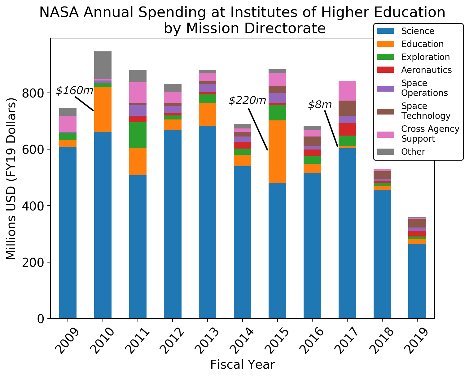
This graph shows NASA's annual spending at institutes of higher education by mission directorate based on all of NASA's grants and contracts that went to institutions of higher education. It is adjusted for inflation to FY19 dollars. The purpose of this graph is two-fold: highlight overall trends in funding over the last decade and validate the datasets and my methodology for cleaning the data. NASA's research spending comes primarily from four of its mission directorates: the Science Mission Directorate (SMD), the Human Exploration and Operations Mission Directorate (HEO, does not include the Space Operations Mission directorate, unlike the name suggests), Aeronautics Mission Directorate, and the STEM Education Office.
As can be seen from the figure, spending is lower in FY18 and FY19 than previous years. However, rather than suggesting a decrease in spending at institutions of higher education, the drop in more recent years likely implies the datasets are incomplete. For example, SMD FY19 operational plan spending totaled $6.8 billion. Of that, up to $1.1 billion was dedicated to non-mission, non-facility specific research, with a focus on basic research. As universities conduct the majority of basic research in the United States and SMD's budget has increased over the last 10 years, the $250 million dollars in FY19 from SMD suggests that NASA has not publicly reported all of its contracts and grants or is still in the process of reporting. However, of note, other federal agencies, including the National Science Foundation, fund space research, so it is possible that the totals for NASA science research spending at universities for most years are correct.
Additionally, NASA budget documents show that education spending is fairly constant year-by-year (~$100 million), much of which goes to institutes of higher education. That some years education spending at universities is much less than $20 million and other years it is much greater than $100 million implies the data from USAspending.gov may not contain completely accurate federal account numbers. For example, the value in FY17 is $8 million, whereas FY10 is $160 million and FY15, just 2 years earlier, is $220 million, over twice what was appropriated for the year. The figure shows the values for the most extreme years. SAM.gov, another federal spending and budget website, reports that the NASA education awards listed on USAspending.gov do not fully reflect funding amounts.
Accordingly, this dataset is likely incomplete. For the purposes of this project, I will be treating it as complete. Because the problem seems to impact FY18 and FY19 more than other years, much of the analysis I will conduct will sum over the decade or look at averages over the years to account for some potentially missing data in certain years. Later, I look at the number of awards signed per year, and find that they remain fairly constant, but the average award amount drops, suggesting that reporting requirements might have changed since the new administration came in.
With the caveat that these datasets may be incomplete, the above graph does reveal some information. Notably, the relative ranking of mission directorate spending at universities is likely close to correct. Somewhat unsurprisingly, spending by SMD is the highest, with education and exploration close to tied. Although HEO spends far more each year than the education account, most of that spending is at NASA centers or with private companies. A notable feature in this graph is being able to see the creation of the Space Technology Mission Directorate in FY11 and its growth over time. Another notable feature is that in 2010 and 2011 5-15 percent of money came from other agencies to support NASA projects (labeled cross agency support). These agencies include the Department of Defense, Department of Transportation, U.S. Department of Agriculture, and others.
There are two obvious ways to answer this question: total spending per state and per capita spending per state. First, let's examine total spending per state per year:
As can be seen, a state's universities typically receive between $1 million and $50 million a year from NASA. Only seven states have received over $100 million in a given year over the last decade: California (twice), Colorado (twice), Maryland (twice), Michigan, Massachusetts, Arizona, and Alabama. Each of these states has many large research universities known for their engineering programs. Additionally, several of these states are home to one or more of NASA's field centers, including California (Ames Research Center and the Jet Propulsion Lab (JPL), a federally funded research and development center (FFRDC)), Maryland (Goddard Space Flight Center), and Alabama (Marshall Space Flight Center). In cleaning my data, I actually excluded contracts and grants that went to the California Institute of Technology (CalTech), as this school operates JPL, so almost all of the money that flows through CalTech does not end up going the school, but to NASA's FFRDC. Additionally, the datasets only reported expenditures at JPL for 2019, so it seems that there was a change in reporting methodology which I wanted to account for.
Additionally, every state had at least one year where it received over $1 million dollars. Some states, such as West Virginia, are in the lower ranks of recipients for most years, but then have a single year with a large award. Looking through the award descriptions, these years are often due to a university winning a grant to establish a NASA Center of Research (NCOR) for a specialized topic or to build a large scientific experiment for that uses a sounding rocket or upper atmosphere balloon.
To examine whether states receive the same amount of funding each year relative to other states, I found the 10 states with the most and least total funding from FY09-19 (split five and five, plotted below in color). I then examined the relative ranking in received funding for of each of these states in every year, shown in the figure below. As this project focuses on the states, I exclude Puerto Rico, Guam, and the Virgin Islands. Over this entire period, the Virgin Islands received $1 million and Guam received $240,000, by far the lowest of any state or territory. Puerto Rico received $38 million over 11 years, putting it at 46th place over this period. I include the District of Columbia in my analysis as it receives a large amount of funding each year (approximately $15 million annually) and NASA is headquartered there. The gray lines in the figure below are for the middle 40 states.
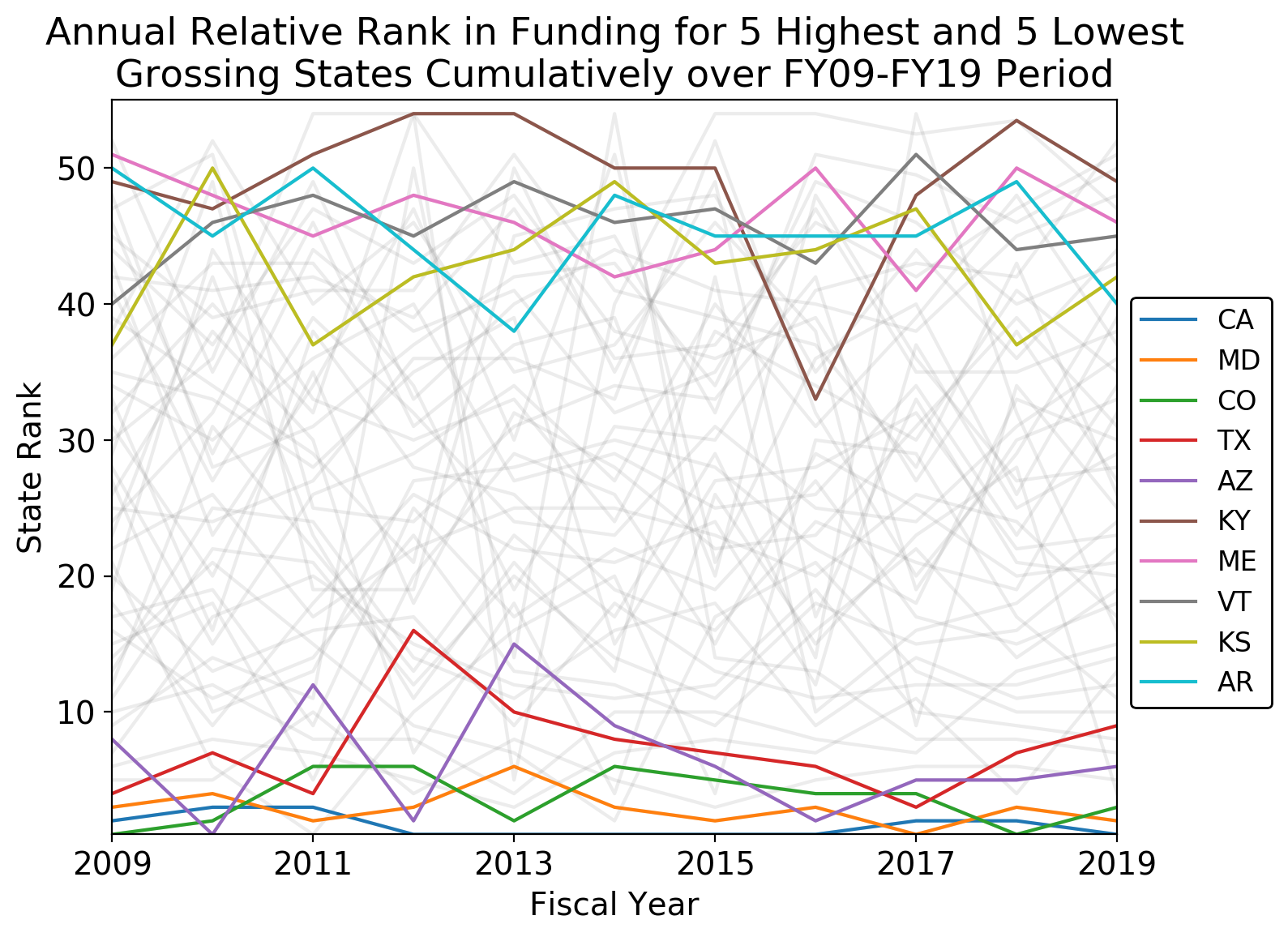
Notably, although states remain within 25 percentage points of their overall position, there is a lot of movement year to year. For example, Kentucky, which was the lowest overall ranked stated as it received $16.8 million over 11 years and in 2018 received even less money than Guam and the Virgin Islands, was ranked 33rd 2016. Additionally, both Texas and Arizona's positions have been volatile over the last 11 years. As can be seen, many of the middle 40 states (plotted in gray) also exhibit a large amount of variability in ranking over this time period as well. For example, West Virginia often ranks at the bottom of NASA spending, but has a few years near the top (e.g., 5th in 2013), due to the West Virginia University winning several multi-year awards (~$26 million each) to run the NASA Independent Verification and Validation Facility in West Virginia. As many of the states that have received the most money annually are quite large, per capita spending should also be examined. The figure below shows the total per capita spending by state from FY09-19. Population data is taken from the 2010 U.S. Census.
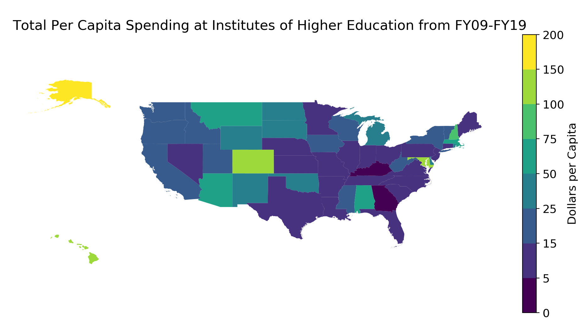
The mean spending per capita per state over the past decade was $17. As several states break $100 per capita (D.C., Alaska, Colorado, Hawaii, and Maryland), spending is not consistent per capita. Both Alaska and Hawaii have universities that operate major NASA facilities, such as the Alaska Satellite Facility ground station, and relatively small populations, which likely explains the per capita spending that state. Colorado and Maryland both have large space industries, as the home to the United Launch Alliance and Lockheed Martin, respectively, along with several large universities that are strong in space sciences, which may explain why they receive so much funding. Additionally, the District of Columbia's top rank (at $188 per capita) may be due to it being the only entity in this analysis that is a city, and one that happens to have several large universities at that. In this analysis, I did not break down spending for any other cities, but imagine that other cities with many universities, such as Boston, would also bring in a similarly per capita amount of money. However, this would be obscured in this graph as it is averaged over states' populations. Kentucky is the only state that was among the lowest in total amount spent and per capita spending. From my experience as an astronomy graduate student, I know that many of universities in Kentucky do not have large space science departments. Additionally, Kentucky is not particularly close to any NASA center. However, I am not sure why research universities in Kentucky tend to focus on non-NASA sponsored research.
To quantify the relationship between state size and total NASA research spending at universities, I conducted a linear regression between the two:
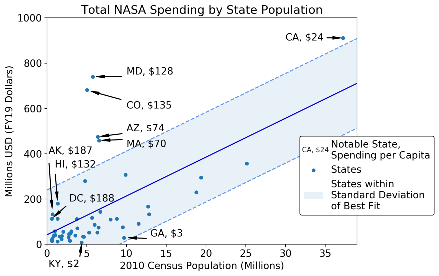
From the regression in the graph above, the expected total obligated amount for a state can be modeled as 17.14 * state population + 4.7 *10^7. As such, universities in larger states are expected to receive disproportionately more money per capita than those in smaller states. This may also be a function of the number of research universities in a state, with the most prolific research institutions generally in larger states. Unfortunately, the datasets I have do not contain the total number of universities in a state, but just the universities that received awards. Based on the above graphs, I think it would be an unsound to assume that universities in each state equally receive awards from NASA, so it is difficult to further investigate whether the number of universities should be accounted for in this regression.
Although the data in this dataset contains some information about the award, the data are incomplete and uncategorized, so it is difficult to analyze the specific types of research each state is conducting. However, we can look at the major mission directorate spender in each state to see where state's relative research strengths are. As noted above, SMD is the largest total spender at institutes of higher education among mission directorates. However, as the upper panel of the figure below shows, it is not the largest spender in each state. The lower panel examines the largest non-SMD spender per state.
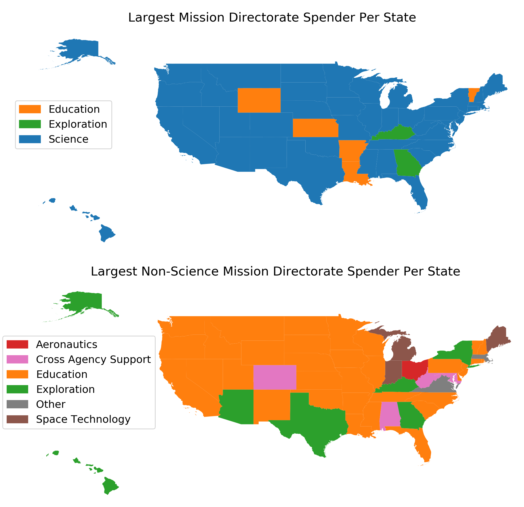
After SMD, the STEM Education Office is the largest spender in almost every state (and the largest spender in a few). This is due to a NASA program that supports state-wide organizations dedicated to funding high school, undergraduate, and graduate space research and education, called the space grant consortium. The program is meant to equitably split money between states. This can be seen from the graph. In states with very low total funding, including Kentucky, Kansas, Arkansas, and Vermont, Education is the largest NASA funder of universities, meaning they are receiving more money than the research they conduct would normally call for.
Although this plot does not show what every state's research strength, there are a few notable features in the plot. For example, HEO is the second largest funder in Texas. This is likely due to the Johnson Space Center, where astronaut training is conducted, is located in Houston. A number of universities, especially Baylor, conduct a large amount of medical research on astronauts and run their medical centers. That Ohio's second largest funder is Aeronautics speaks to the state's history with aviation. The National Advisory Committee for Aeronautics, the precursor organization to NASA, was heavily involved in the state. Today, the Glenn Research Center in Cleveland is one of NASA's largest aviation research facilities. Additionally, Michigan's funding by the Space Technology Mission Directorate (STMD) shows the strength of aerospace engineering programs of multiple of the state's universities, especially as STMD was not founded until 2011, meaning that its funding occurred over two fewer years.
Prior to starting at UW-Madison for graduate school, I worked in federal space policy in Washington, D.C. for the last three years. The plots in this section are related to the main focus of this project--namely what are the characteristics of NASA's spending at universities and does this money help meet secondary goals of economic development--but were also selected due to my professional interests in federal spending and contracting and their relation to some of the work that I did.
Due to the history of cost overruns when using cost plus contracting mechanisms, NASA has recently been making a push to use more fixed price contracting. Under fixed price contracting, companies bid how much money they expect a project to take. If a project faces cost overruns, the company is responsible for paying for the overrun. Under cost plus contracting, the government would be responsible for paying for project cost overruns. Although cost plus contracting is usually the appropriate contract mechanism for risky technology development (such as the James Webb Space Telescope, a new space-based telescope), as no sane company would put itself on the hook for covering the cost of developing technologies that currently do not exist and are hard to estimate the costs for, this type of contract often carries large overhead costs. NASA has found much success in reducing the costs of developing less risky technology that has been made many times before (such as rockets and some spacecraft) by using fixed price contracts. For example, programs such as the Commercial Crew program and Commercial Orbital Transportation Services, and the new moon landers just announced have been contracted using fixed price contracts. The figure below shows the total number and average value of contracts and grants signed each year by award type.
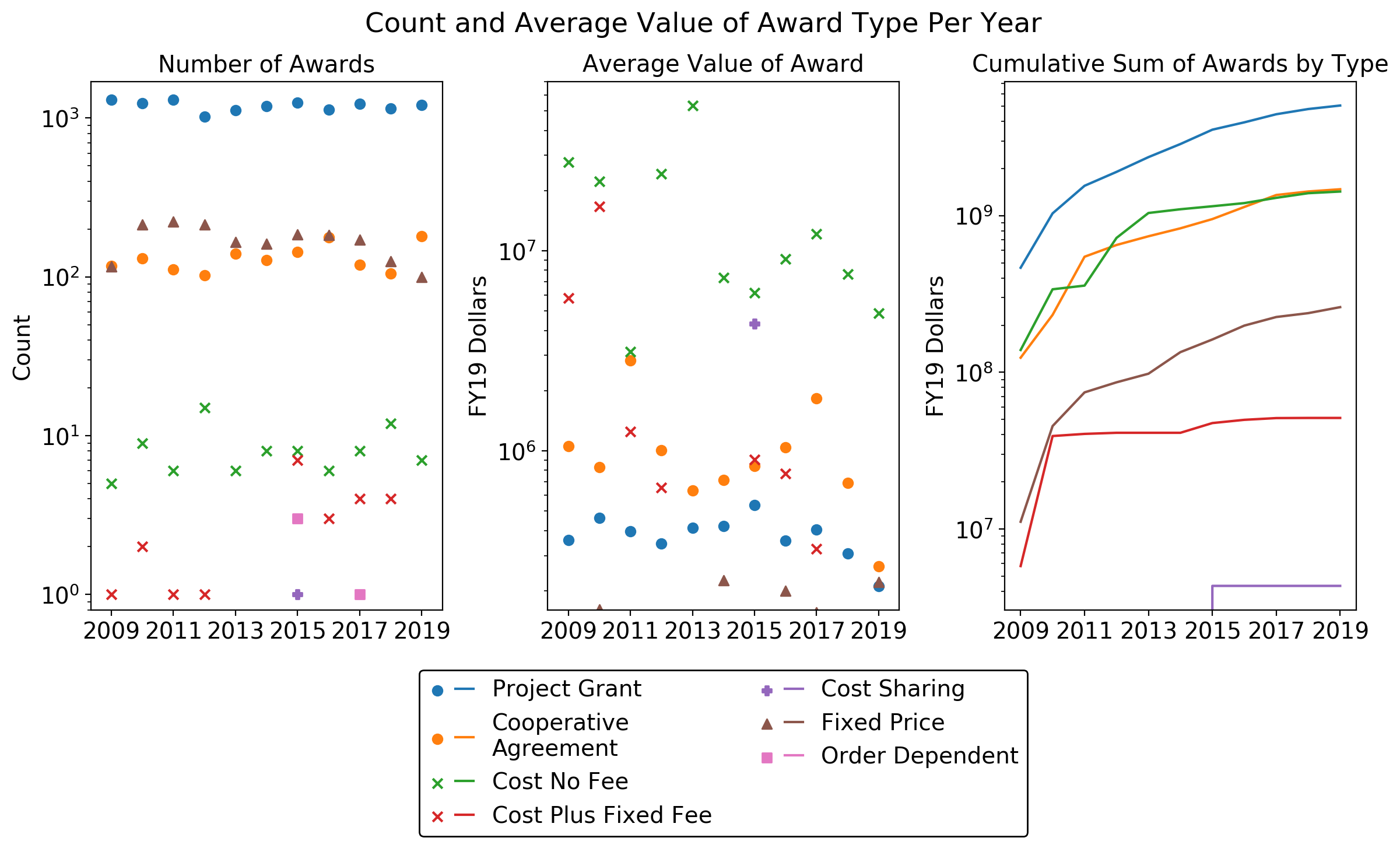
As can be seen, the relative number of awards by type did not change much, if at all, since 2009. Project grants are by far the most common type of award made to universities, at about 80 percent of total awards each year. However, these awards are often quite small, with the average amount approximately $34,000. Conversely, the average cost no fee contract size is approximately $1.4 million. These awards are primarily for scientific studies and small experiments. Examining award descriptions, these contracts are primarily for building hardware that NASA will benefit from, such as an instrument. Although the number of annual fixed price awards is greater than the number of cost awards, the values of the cost awards are much higher. Notably, it does not appear that NASA is moving toward fixed price contracts from cost contracts with universities, as the number of fixed price awards has declined by half over the last 3 years. One thing that is very interesting is that although these datasets report that NASA spent less at universities in 2018 and 2019 than in previous years, the number of awards has remained relatively constant. For example, the total number of awards made in 2019 was 1494, which is higher than 3 years from FY09-17 and only 10 percent less than the peak number of awards in 2011 (1647). As such, the average value of contracts has been falling over the last few years, which can be seen in the righthand panel for cost no fee contracts, cost plus fixed fee, cooperative agreements, and project grants. This may suggest that spending is after all falling at research universities. Alternatively, reporting requirements may have changed in that smaller awards are now required to be reported in USAspending.gov, driving down averages, and large contracts have yet to be entered into the system. Based on experience working in public policy, it is very possible that reporting requirements changed after the new administration entered office. Over the 11-year period, project grants made up the lion's share of spending (61 percent), with cooperative agreements and cost no fee contracts each comprising approximately 17 percent of total spending. This is to be expected, as project grants are the primary funding mechanism of scientific studies, and much of that research is conducted at institutes of higher education.
As noted above, I do not have information on the number of universities per state. However, we may be able to find a proxy for this number by looking at the number of awards won, assuming that universities win equal numbers of awards (this is probably not a good assumption).
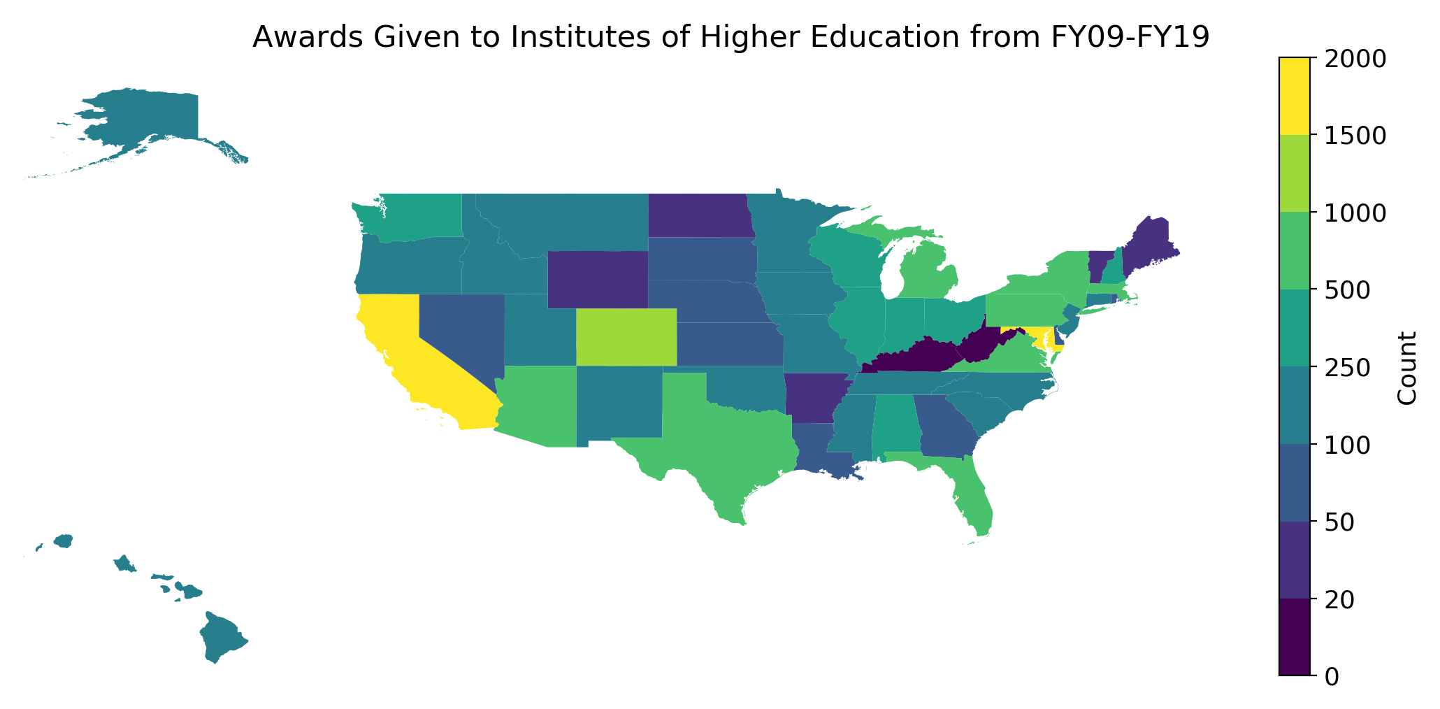
In general, the number of awards won traces the earlier metrics of both total amount and per capita spending. One notable exception is Virginia, which had the 20th highest total award amount from FY09-19 ($109 million), but had more awards signed than the next 11 states ranked higher in total award amounts (Virginia had 534 awards, whereas Florida, in 9th place for total spending had 616 awards). It is possible that this is due to the type of research conducted in Virginia tends to win smaller scientific awards, whereas other states have won fewer but much larger awards, such as those that establish a research center or build technology. However, looking at this map, the states that won the most awards--California, Colorado, Massachusetts, Texas, New York, Florida, Pennsylvania, Michigan, and Arizona--all have high populations, so it is possible that this metric is just tracing population, although there are some exceptions to that, such as Georgia, North Carolina, and New Jersey.
One other question I have been interested in for several years is how long does it take from money being appropriated by Congress to when contracts are signed to begin work. For reference, the federal fiscal year begins on October 1. The graph below is the number of awards made on average by month over the last 11 years, sorted by whether the award was the primary award or a subaward under a primary award.
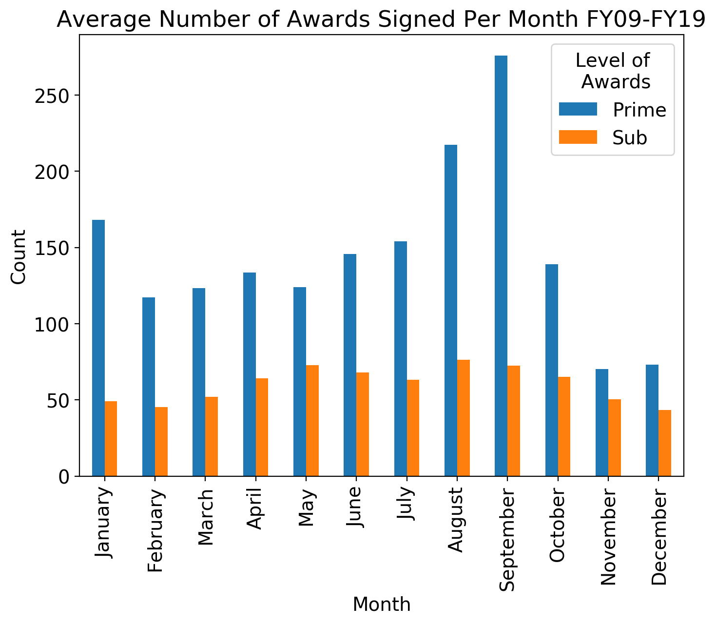
In recent years, due to government shutdowns and continuing resolutions, under which no new work may begin, budgets have not been appropriated until later in the fiscal year for several of the years over the last decade. I believe that you can actually see this in the graph, as the number of prime awards signed in October, November, and December are much lower than prime awards signed later in the fiscal year (most continuing resolutions in recent years have lasted through December). The relative peak in October compared to the remainder of the calendar year may be due to projects that were prepared earlier and are ready to go but must wait for money to be appropriated before they begin. In years without a continuing resolution, this is October 1, and as such many project begin in this month. Looking at the start dates of prime awards made in October, many are dated October 1, which suggests this interpretation is correct. Additionally, the relative spike in January compared to other months around it may be because of projects that have been able to start after continuing resolutions are superseded by actual budgets. One other interesting feature of the graph is the highest peak is in September, at the end of the fiscal year. This is likely because all money must be obligated in the year it was appropriated, otherwise agencies lose the money, so NASA rushes to sign awards before the money is returned to the Treasury. Subawards follow a slightly different pattern, in that more awards are signed in the second half of the year than the first, but some trends seem to be followed (e.g., fewer subawards in November and December than other months of the year). This may be due to subcontract dates on awards lagging behind main award as money must first be authorized for the prime award before subawards can be signed.
Finally, these datasets include standardized descriptions of the type of organization that received an award. In the contract datasets, organizations designations were quite detailed, Census-based descriptors (e.g., minority-owned business, 1862 land grant college, veterinary college (one received an award from NASA)). In the grants datasets, descriptions were more limited: public/state institute of higher education and private institution of higher education. As such, I sorted the contract-receiving organizations into these two designations where applicable. The graph below breaks down total spending by educational institution organization type.
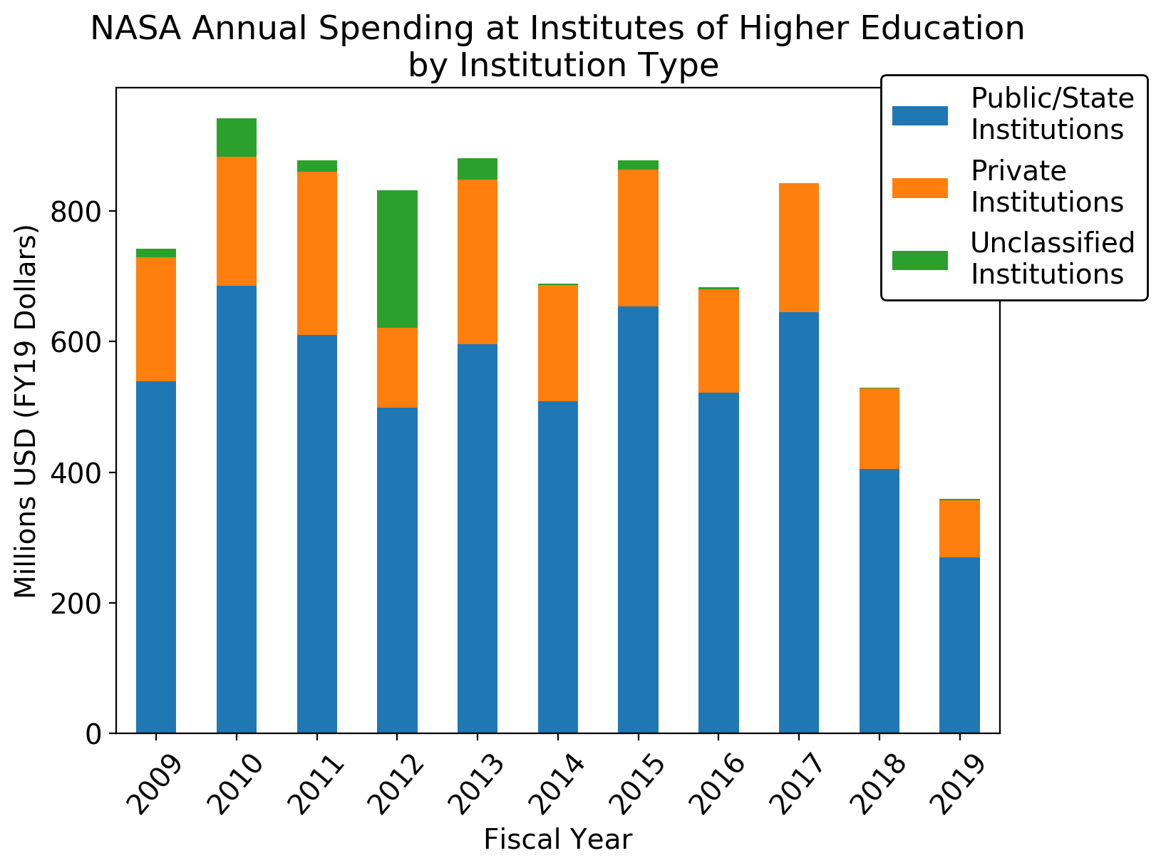
Private universities on average comprise 24.8 percent of NASA's total spending at universities (excluding 2012 due to unclassified data). Although research in the United States is conducted at many types of institutions, the plurality is done at R1 research universities. Of the 131 R1 research universities in the country, 28 percent are private. After doing some quick Poisson statistics, these percentages are effectively identical. This suggests that both private and public institutions conduct research of equal interest to NASA, which makes sense as these institutions all conduct similar types of research.